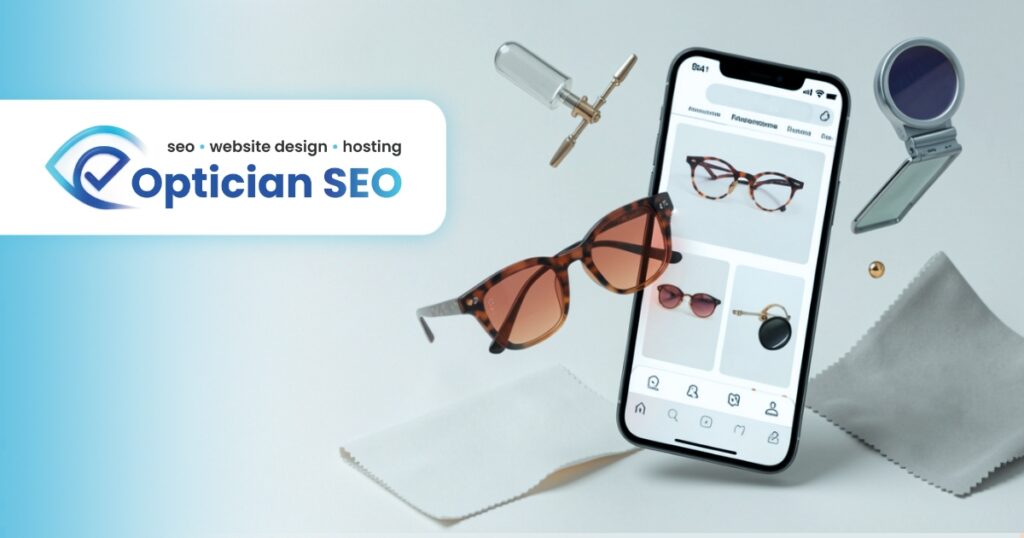
Most local searches for eye care services are performed on smartphones. A mobile-responsive website automatically adapts to different screen sizes, ensuring that text is readable, images display correctly, and forms are easy to complete on any device.
Responsive design includes touch-friendly navigation, optimised layouts, fast-loading mobile pages, and clear calls to action such as “Book an Appointment” or “Call Now.”
For opticians, this is particularly important because prospective patients often search while on the move and want immediate access to contact details, directions, and treatment information.
A mobile-responsive website improves both search rankings and user experience. It increases the likelihood that visitors stay on your site, view multiple pages, and submit enquiries. This leads to more local customers, better engagement, and enhanced brand credibility across all devices.